Sad Kids Collective
Role: Branding + Web Design Consulting
About the client: Sad Kids Collective is an artist management company offering strategic planning, grant writing, and day-to-day business management services to artists.
Overview:
The client wanted a brand identity for their company launch and sought web design consultation. The musicians represented play melancholic pop music and Sad Kids Collective had a penchant for youthful-feeling minimal, yet fun designs. The client wanted versatility in their logo’s shape to work well on apparel.
Details + Process:
Logo: I worked directly with the founder of Sad Kids Collective. After an initial conversation, I sent a short brand questionnaire and exercise to understand where their brand is situated in the industry and what their hopes are for the branding aesthetically. I then put together 3 drafts, first a collection of different ideas, then refining the chosen logo direction with feedback after each draft. Finally, the final logo was presented in 4 forms: primary logo (vertical), icon, horizontal logo, and a wordmark, in white-over-black and black-over-white versions.
Website: I consulted on website design: advising on typography, how to work in the web builder (Squarespace), provided content feedback (copy edits, marketing ideas), as well as assisted with back-end issues. I updated the client on unresolved and resolved issues along the way and provided alternatives to bottlenecks until the website looked as desired and worked well.


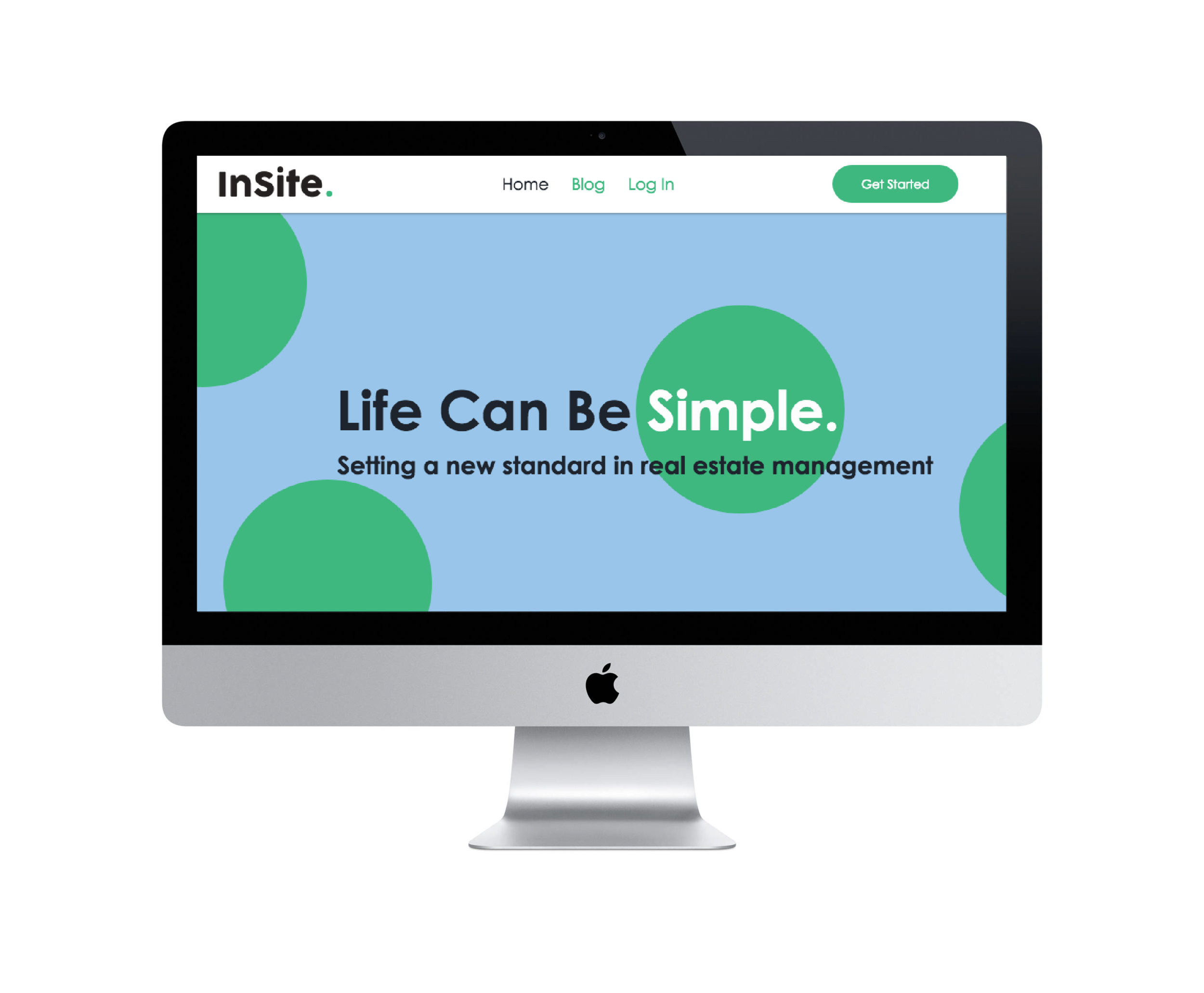
InSite
Role: Logo Design
Collaboration with Chicago-based creative agency, Poolhouse Creative
About the client: InSite is an app / software developed for enabling property managers to easily create presentation-ready reports, receive and execute quotes from contractors in seconds, get relevant geo-targeted contractor recommendations, track property progress and issues over time, and more.
Overview + Process:
The project brief included design inspiration and reference images (other logos and app designs) from the creative agency and the client wanted us to consider using green as an accent colour (or use green, yellow and red to reflect the app’s progress report colours: Outstanding (red), Ongoing (yellow), and Complete (green) in the logo design.
I presented a slew of logo drafts to the creative agency. The project timeline was tight, so I worked with the team at the agency to discuss feedback over the phone. After refining the agency’s top choices, we worked together to land on the final design, a friendly sans serif (COCOGOOSE Regular) with a bright yet calming green accent. We decided it was most effective to highlight the “Complete” part of the app’s process in the app.
Pictured below is an image of the logo in use on their website.